UX Laws Every Designer Should Know

The foundational rules of Human-Computer Interaction (HCI) defines how people perceive and interact with digital products, there is a set of rules that every designer should know. Their are principles that can be applied at both(macro & micro) levels while designing product.
Scope of design is quite broad with a lot of different areas. In this article we’ve listed few laws that every designer should know.
UX laws every designer should know
Every human action includes an interaction. Whether this involves calling someone over the phone or cooking a meal in your kitchen, every activity has been designed by a human being for the rest of the race.

Here is a list of 10 UX laws every designer should keep in mind while designing :
1. Fitts’s Law

“The time to acquire a target is a function of the distance to and size of the target”. As the distance increases, movement takes longer and as the size decreases selection again takes longer.
Fitts’s law is used to model “Conceptual model” the act of pointing, either by physically touching an object with a hand or finger, or virtually, by pointing to an object on a computer monitor “Computer monitor” using a pointing “Pointing device”.
2. Jacob’s Law

‘Users spend most of their time on other sites. This means that users prefer your site to work the same way as all the other sites they already know.’
As designers, it is our objective to ensure people successfully achieve their goals when using the interfaces we’ve built by eliminating as much friction as possible.
Not all friction is bad—in fact, sometimes it is even necessary. One of the primary ways designers can remove friction is by leveraging common design patterns and conventions in strategic areas such as page structure, workflows, navigation, and placement of expected elements such as search.
When we do this, we ensure people can immediately be productive instead of first having to learn how a website or app works.
3. Hick’s Law

Hick’s Law predicts that the time and the effort it takes to make a decision, increases with the number of options.
Think back to a visit to an restaurant . It’s easier to pick a dish if the store offers only 3 choices, versus making a choice among 20 different dishes.
Similarly, while designing the experience for a user online, you can use hick’s law to reduce the options on the screen so that the user can accomplish the goal without being confused or giving up.
4. Miller’s Law

‘The average person can keep only 7+-2 elements in their working memory.’
Memory is a limited resource.The structure and flow of information on a webpage or app should be designed keeping this crucial law in mind. If we flood the screen with more than 9 elements, it leads to a cognitive overload causing the user to lose interest. Overloading pieces of information beyond the average memory capacity is an example of bad user experience design.
5. Parkinson’s Law

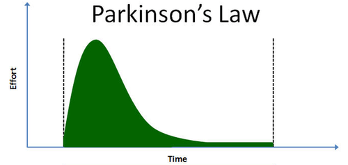
‘Any task will inflate until all the available time is over’
Parkinson’s law, also known as the law of productivity, states that we delay a task that does not have any defined deadlines. Hence, when this rule is applied to user design, we see that certain tasks are best accomplished with the ticking clock icon.
This is especially true for ‘one-time passwords’ that are shared while net banking or booking airline tickets. The sense of urgency helps in prompting the user to take action.
The illusion of the clock running out is actually proved to improve the odds of conversion and speed up the sale in general.
6. Tesler’s Law

‘For any system, there is a certain amount of complexity that cannot be reduced’
A big mandate of the UX design process is simplicity and reducing steps of the process. Conversely, there is a logical number of steps required to get the job done which cannot be reduced by any number of permutations and combinations.
Hence, in order to preserve the utility of the product or service, a certain number of actions or decisions must be taken by the end-user to efficiently meet his/her needs.
7. Law of Proximity

The Law of Proximity states that objects that are near or ‘proximate’ to each other tend to be grouped together. It is part of the Gestalt Laws of Perceptual Organization and Gestalt psychology.
Basically, the Law of Proximity states that the brain more closely associates objects close to each other than it does when objects are spaced far apart. It is thought this kind of clustering occurs because humans often have a natural inclination to want to group and organize things in a neat and organized manner.
8. Postel’s Law

Be empathetic to, flexible about, and tolerant of any of the various actions the user could take or any input they might provide.
Anticipate virtually anything in terms of input, access, and capability while providing a reliable and accessible interface. The more we can anticipate and plan for in design, the more resilient the design will be. Accept variable input from users, translating that input to meet your requirements, defining boundaries for input, and providing clear feedback to the user.
9. Serial Position Effect

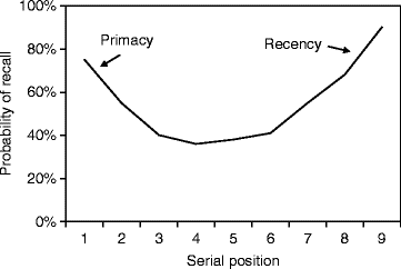
The serial position effect, a term coined by Hermann Ebbinghaus, a German psychologist and pioneer of memory research, describes how the position of an item in a sequence affects recall accuracy. There are two main concepts involved in the serial position effect:
- The Primacy Effect: “What is Primacy Effect?” Items that are presented at the beginning of a list are recalled with greater accuracy than items in the middle of a list.
- The Recency Effect: “What is Recency Effect?” Items that appear at the end of a list are also more likely to elicit better recall than items presented in the middle of a list.
10. Occam’s razor
When given options to solve a problem, go with the one that has the fewest assumptions.
Hope you find this helpful!
Keep smiling 😄